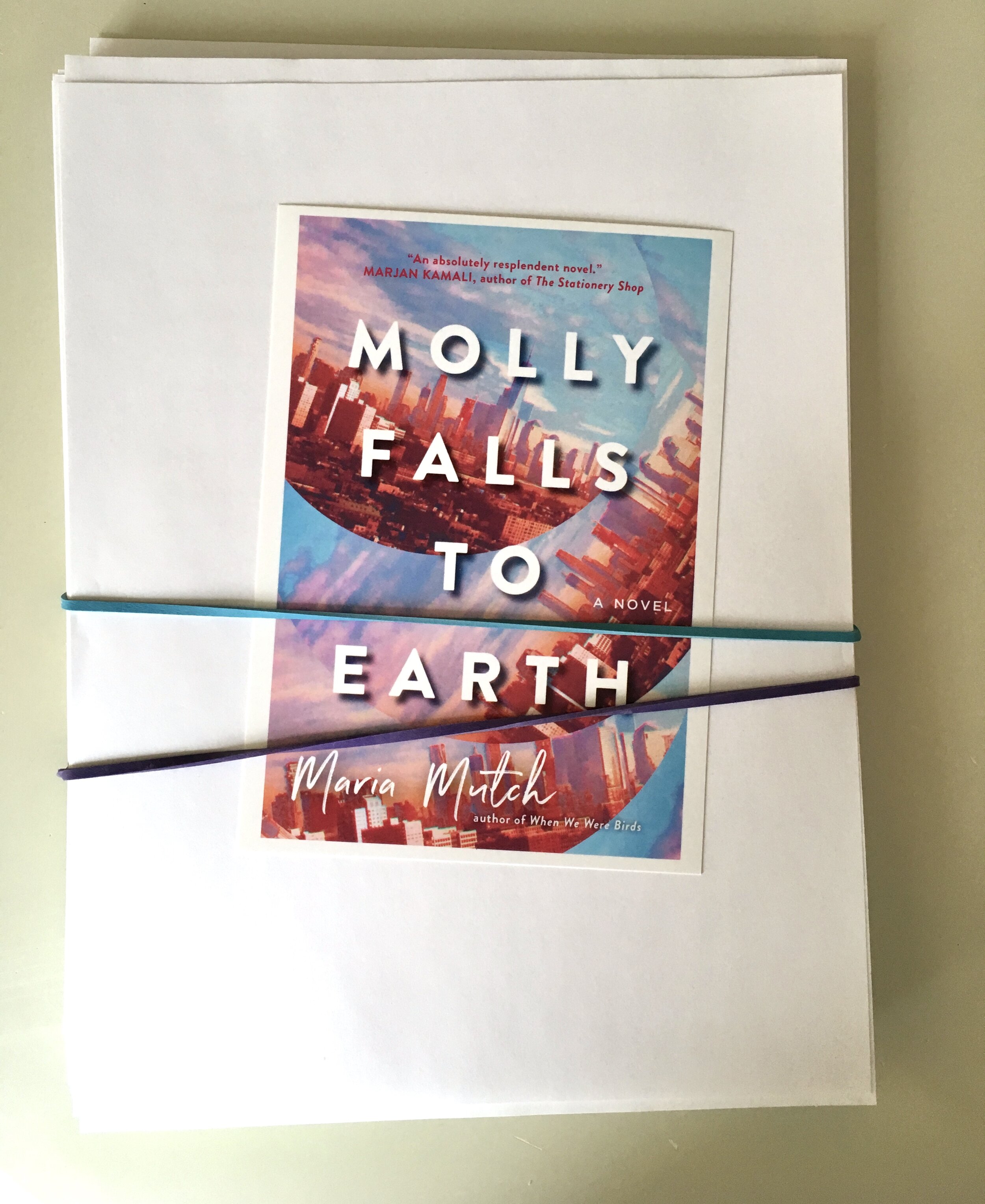
Introducing Molly…
to be released
April, 2020
It’s done!
Complete!
This is my third book, but my debut novel (yes, friends have joked with me about writing a book in each existing genre). MOLLY FALLS TO EARTH is now complete, even the acknowledgments. All the larger edits have long been done, and the copyedits, too, and then a proofreader read the manuscript after that (which is when you really know you’re done). And this being my third go-round, I can say that the copyediting still astonishes me, and maybe a little more so than the general editing, which is its own kind of magic for sure, but one that I more or less expect. The fineness of the copyedits is what I’m talking about here, how every tiny decision in terms of commas and paragraphs and eccentric wording is accounted for, every character (meaning both characters and the letters on the page) noted and gone over numerous times. There are, too, the ensuing discussions in the margins and by email of what is meant by something and should it stand or be changed for something else. It’s a beautiful process, in part because it means you’re almost done, and it involves other people, including ones you don’t know, after you’ve spent so much time (months, years) of being with the ideas and story mostly alone (apart from, in this case, the wonderful company and astute mind of my acquiring editor, and then a few writing friends besides). And if you can get over the closeness of the inspection, how you’ll be questioned on things you’ve taken for granted, the process itself becomes enjoyable, even if it’s arduous (and you don’t want to do yet another read-through, but you must…). It becomes easy to see that great copyeditors are a godsend, and their attention to detail is an art form. And did I mention that it signals completion? Done-ness!
And the jacket design, too. If you’re very visual (I am), maybe that’s the best magic of all. More collaborations and mulling and going back and forth with the (long-suffering) designer. I’ve loved each jacket I’ve had, and the process of finding the right image, the right font. In the case of MOLLY FALLS TO EARTH, the chosen design was one of various iterations, all of them attempts to get at the topsy-turvy atmosphere in the book. The other arrangements and colour schemes were completely different. As the author you get a bit of say, if you’re lucky, but the jacket decisions tend to fall to the larger team, including, naturally, the marketing department. I did campaign for certain things, though, including the title font that you see up there, which, for whatever reason, makes me absurdly happy. If font can make one happy, which I can guess it can. I’ve realized fairly recently that I have a thing for typography and book design and all the small but entirely big details. (WHEN WE WERE BIRDS has a tiny pair of bird scissors on the dust jacket and then a tiny pair of bird scissors embossed on the actual spine, which blew my mind.)
… more to come…
